

About Lang Biang Mountain
Lang Biang has the two highest peaks of the Dalat plateau: Lang Biang with 2,167 meters and Bidoup Ban with 2,287 meters. For that reason they are also called the roof of Dalat. In addition, the nearby Bidoup Nui Ba National Park is also named after these mountain peaks.
The mountain is best known for its amazing nature and spectacular views over the entire Dalat area, with forests, rivers and ethnic villages. Because indeed, this mountain has more than great nature. It is also home to some of the oldest ethnic minority groups from the Central Highlands. A visit to a local village will give you an insight into their unique culture, which has been passed down through the generations and has changed little.
About Lang Biang EZ Water
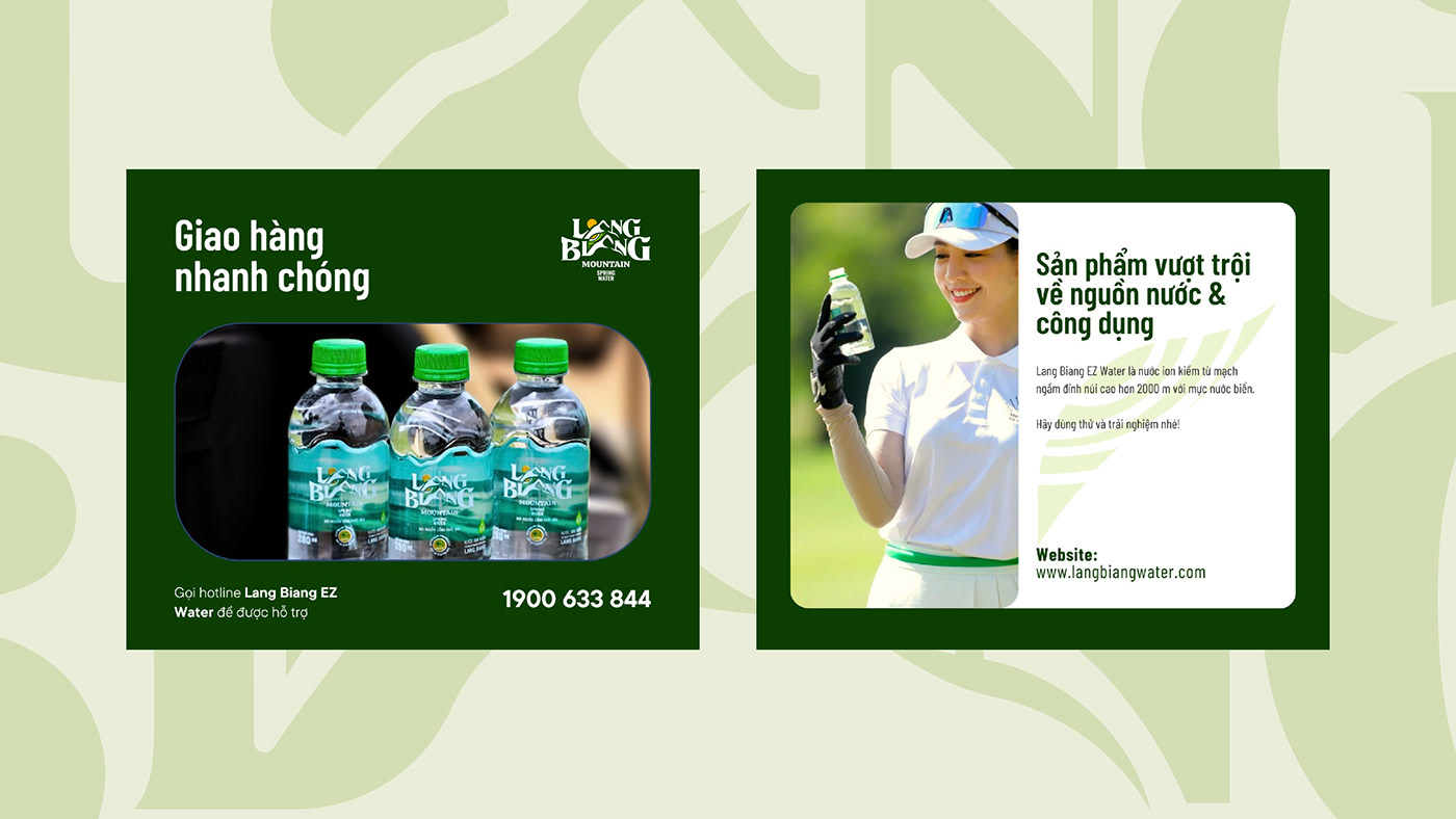
Lang Biang EZ Water is the perfect combination of precious water source from Lang Biang peak groundwater and the advanced quantum technology from Australia. The water is naturally filtered through underground rock layers and contains natural mineral components, which benefits for your health. With the advanced technology from Australia, the water quality is more guaranteed as the impurities are eliminated while retaining natural minerals.

THE SOLUTION
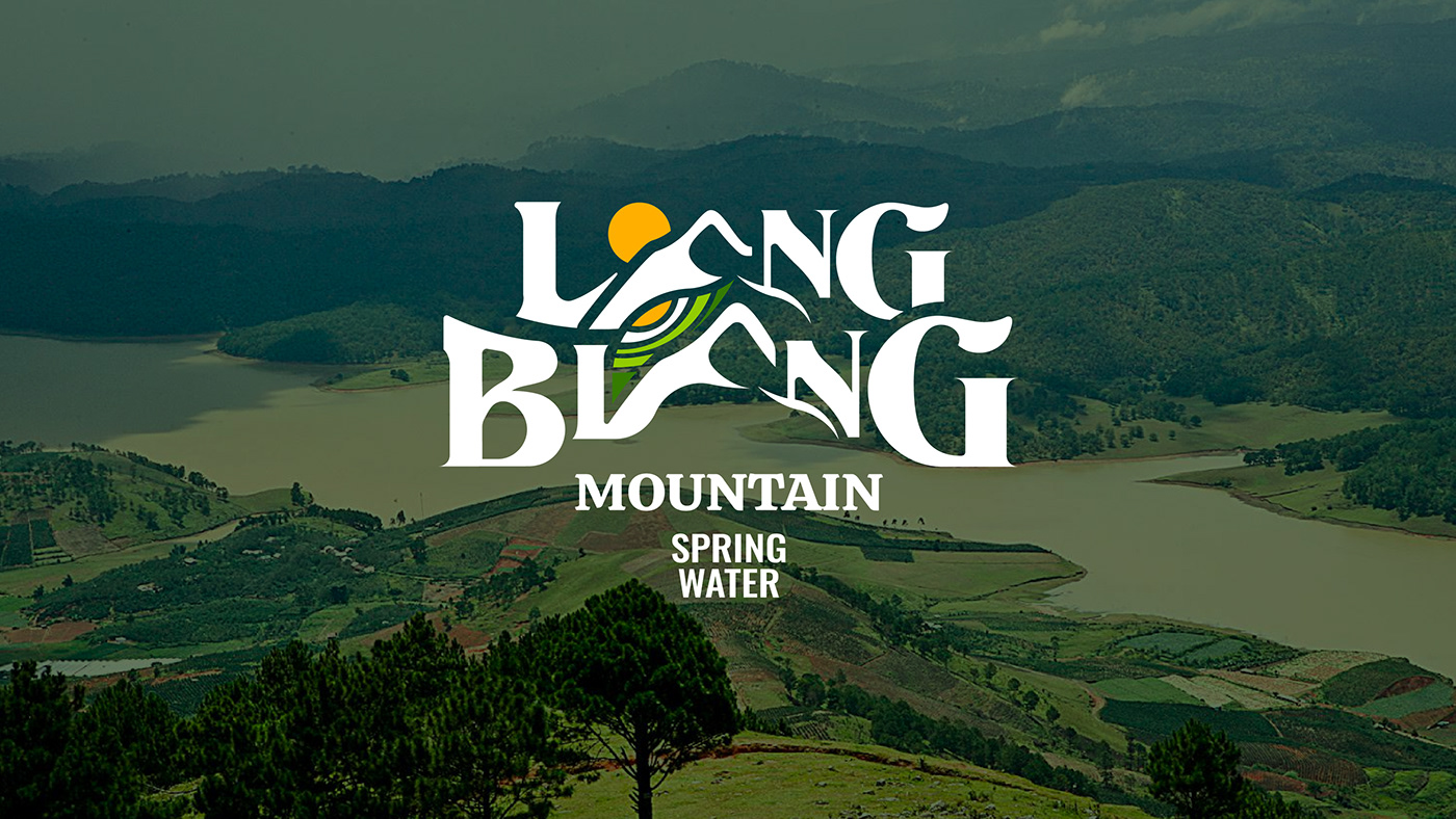
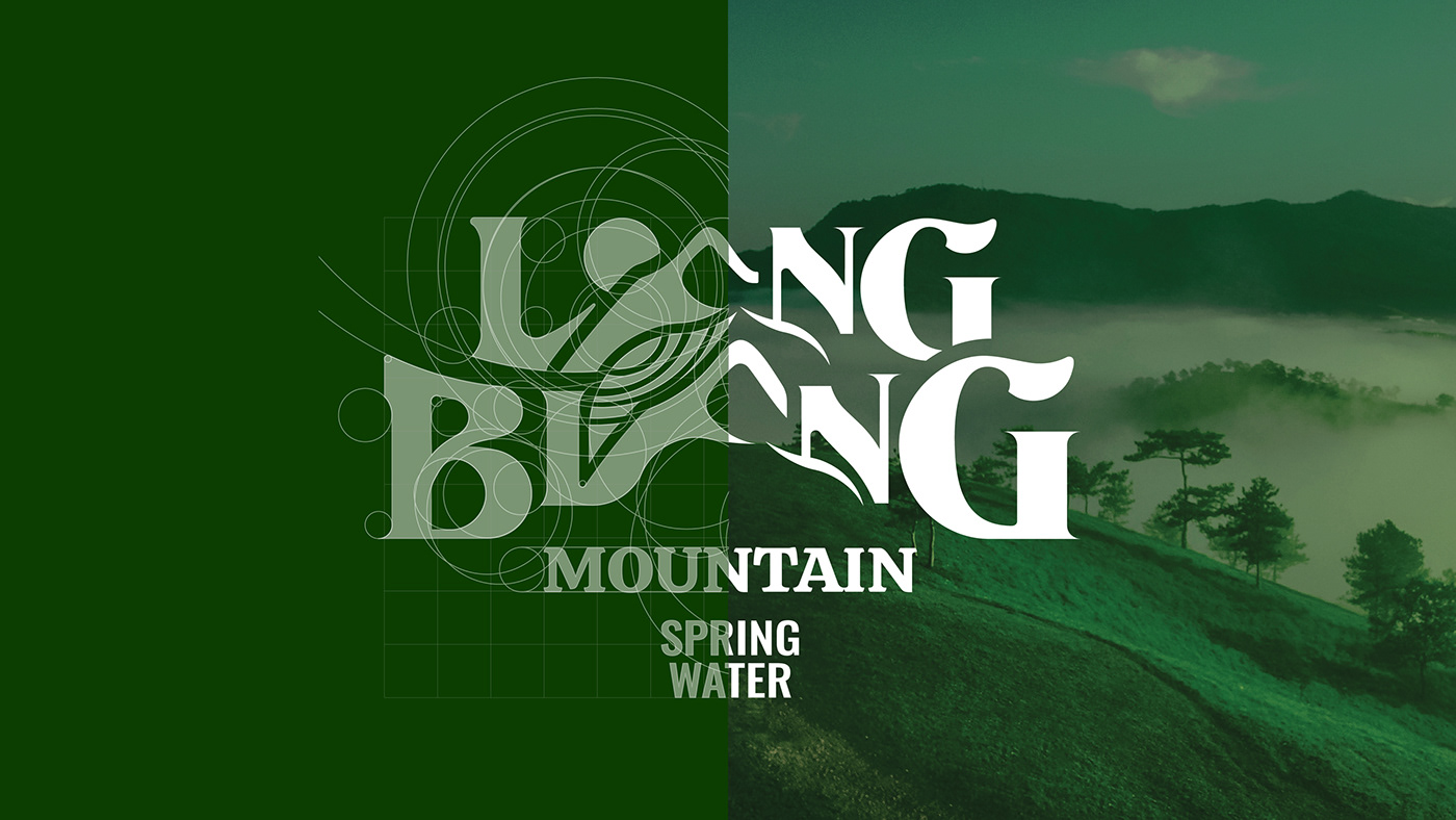
Logo & visual identity
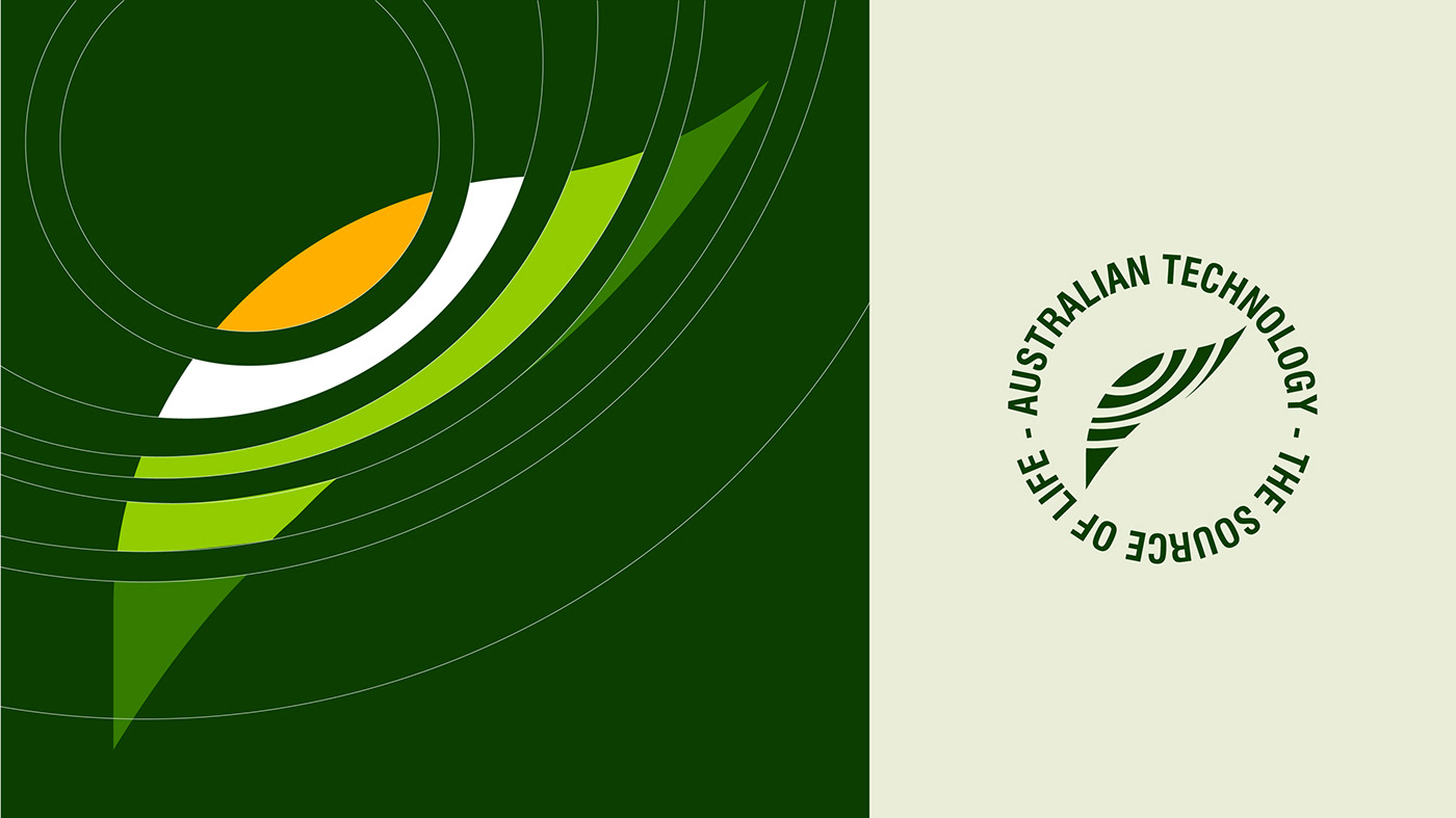
The logo was made with a decorative font for a heritage look. Due to the natural origins of the supplements, we decided to add a the icon of leaf, sunset, water highlight to the logo, which creates a feeling of visual movement. For the color palette, we have selected the colors derives from the aspiration of nature, which is green. The primary color is picked to bring the positive energy, freshness and the liveliness of Lang Biang area. The green color represents the growth, rebirth and fertility. Blended with the natural greed is olive green to create the feeling of peace and harmony. To balance, the yellow color brings the warmth for cold, fresh and frosty winter. The combination of colors in the logo gives us a sense of openess, a clear and coherence direction.
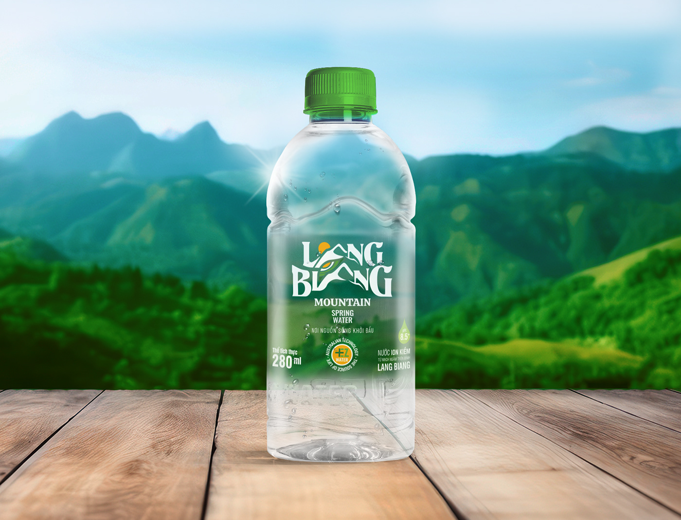
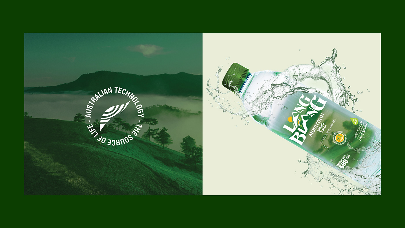
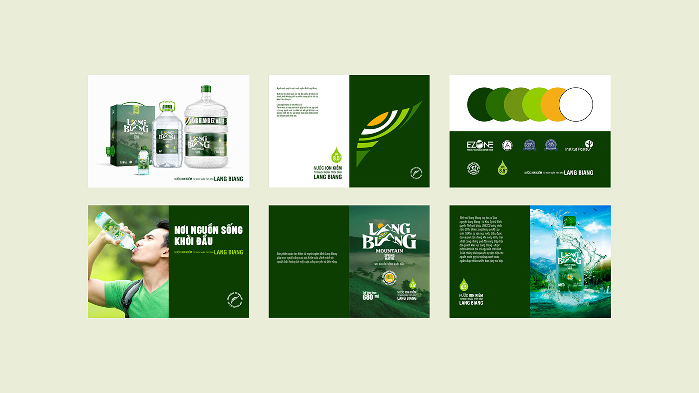
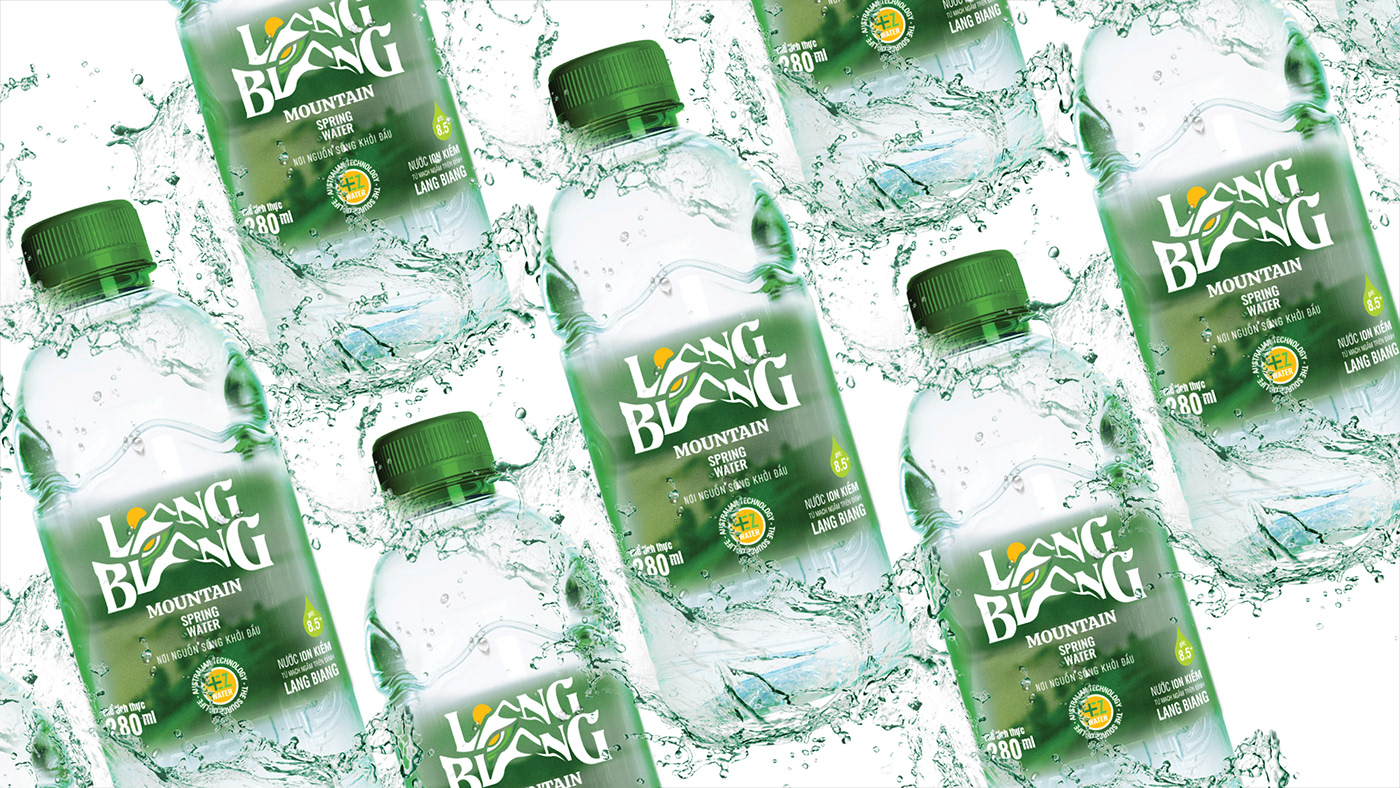
Packaging design
Be aware of the constant movement of nature and the development of essential problems in life. Lang Biang offers EZ Water products from the technology of creating hydrogen, the water molecule is 1/6 of a normal water molecule, providing fast energy for all body activities and spreading stored energy to life. living. Despite of the advanced in the technology, the packaging gives us the purely freshness as long as the images from nature: Mountains, clouds, water, sun,... When enjoying a bottle of Lang Biang EZ Water, we cannot help feeling excited and refreshing as if we are having the precious groundwater among the gorgeous mountains scenarios.
Client: Lang Biang Ez Water
Agency: Design Market
Timeline: 2021
Agency: Design Market
Timeline: 2021
Credit:
Creative Director: Bảo Kỳ
Graphic Designer: Nhật Còm Nhom
Project Manager: Mary Anne
Creative Director: Bảo Kỳ
Graphic Designer: Nhật Còm Nhom
Project Manager: Mary Anne
Let's work together!
→ Start Here


